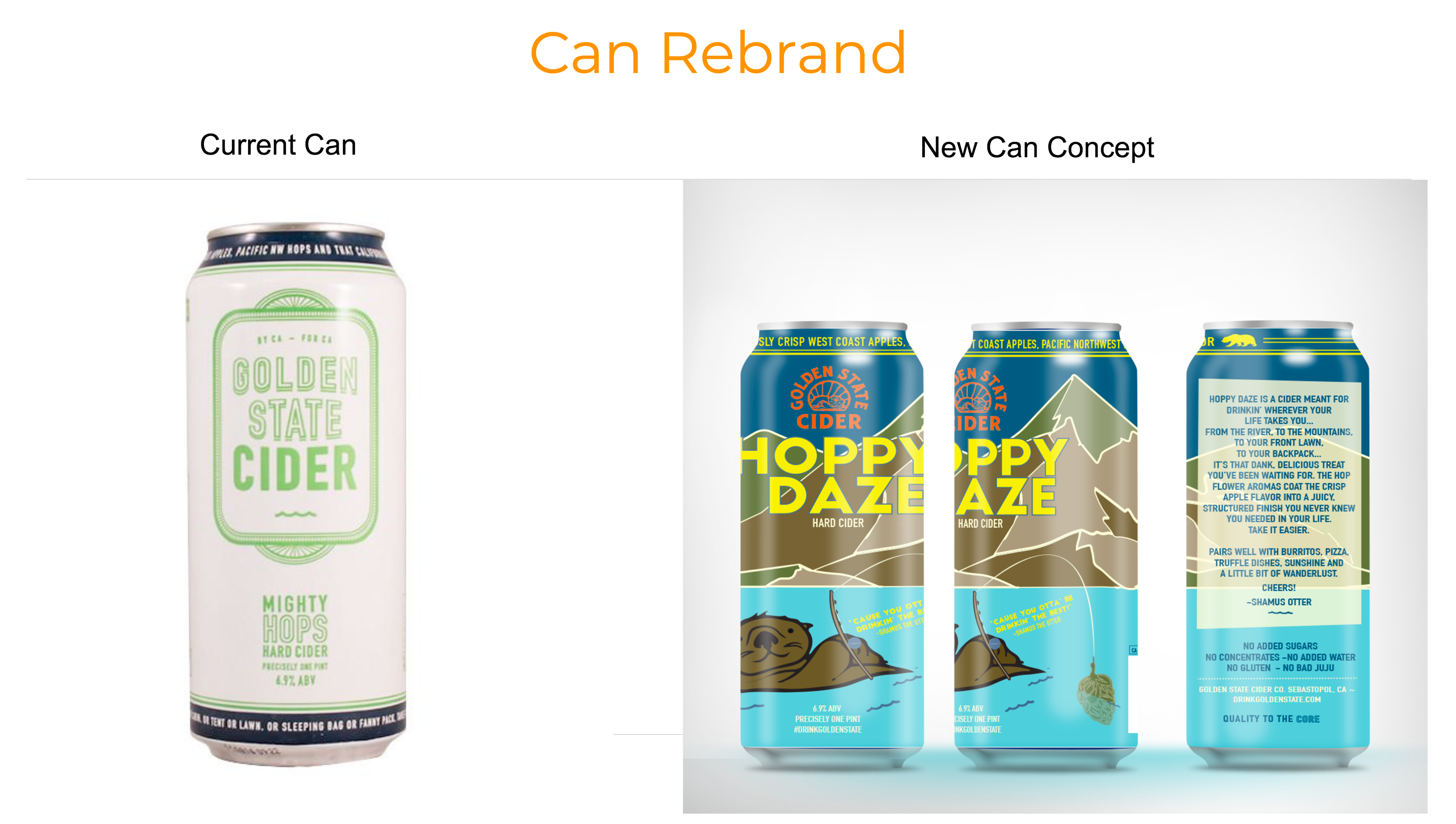
I was asked to redesign Golden State Cider's Mighty Hops can in a fresh take. I did a case study on their competitors and their target market and how it aligned with existing brand values. I did research on how consumers received their current can design and decided that the otter that is currently on the back of the can should be the focal point moving forward so that consumers would connect it more to the solidification of the brand. During my design process I was informed that the brand was already in a process of incorporating the otter and when they supplied their new logo, it became more apparent I was on the right track. The brand emphasizes their cans being able to be taken wherever the consumer's adventure takes them, and as being more convenient than a glass package so my redesign encompassed all of that.
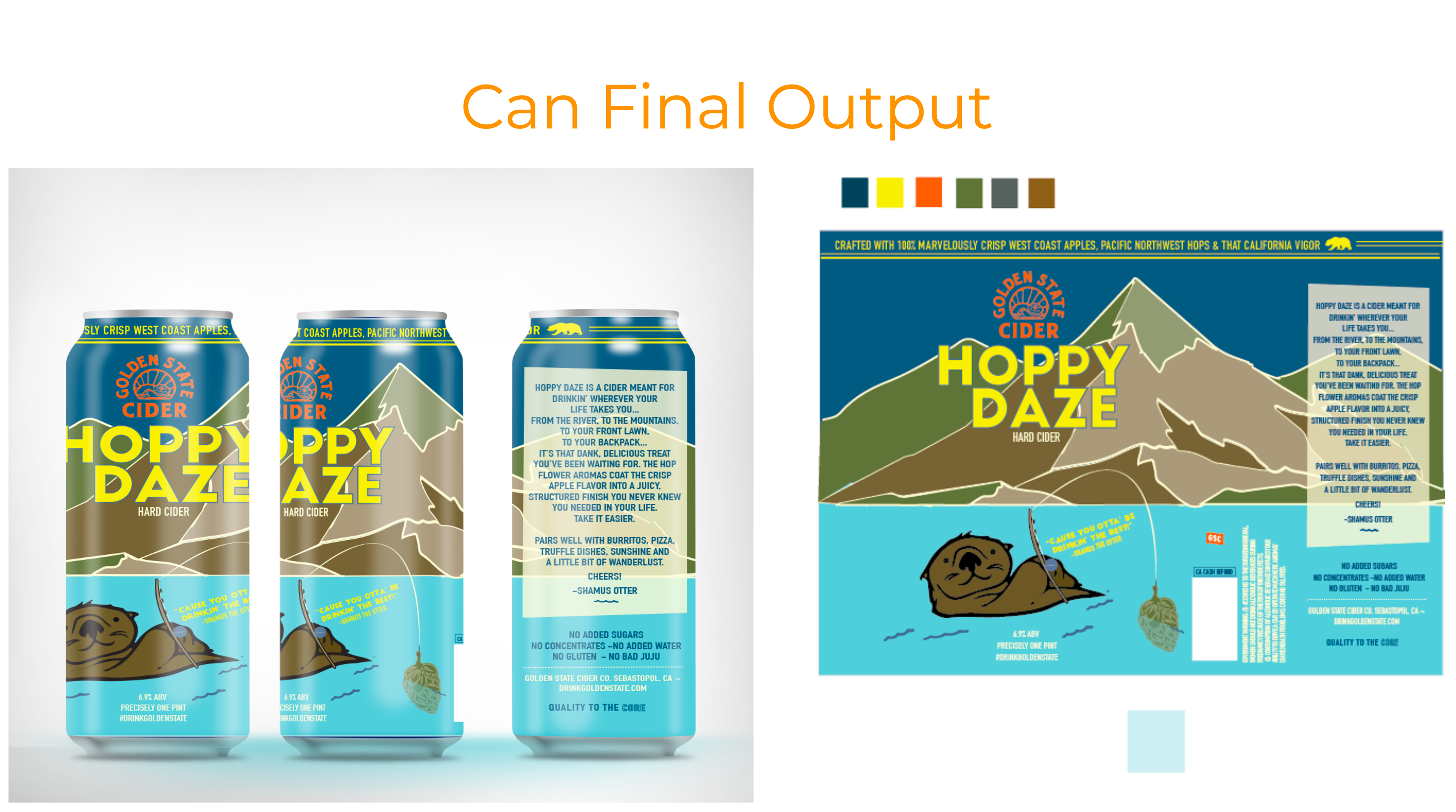
The final output included the update to their logo, a fresh design concept, a rename of their current flavor and a revamp of their existing website.